A digital roof for two houses at once
Web design and usability create a digital home and provide orientation and networking
Information architecture, web technology and online accessibility for the Jewish Museum Frankfurt am Main. With a color guidance system and diverse modules, the new website creates orientation and clarity for users and editors alike.
Renovation - analog and digital
While work was underway on site in Frankfurt to remodel the Jewish Museum, renovations were also on the agenda at the museum's digital home. A relaunch of the more than ten-year-old website was planned to round off the reopening of the houses on all channels. So we too unpacked our tools of the trade in Hamburg and Cologne, for a new digital umbrella that required the implementation of a new CI as well as design, web design, UX and programming.
One museum, two houses
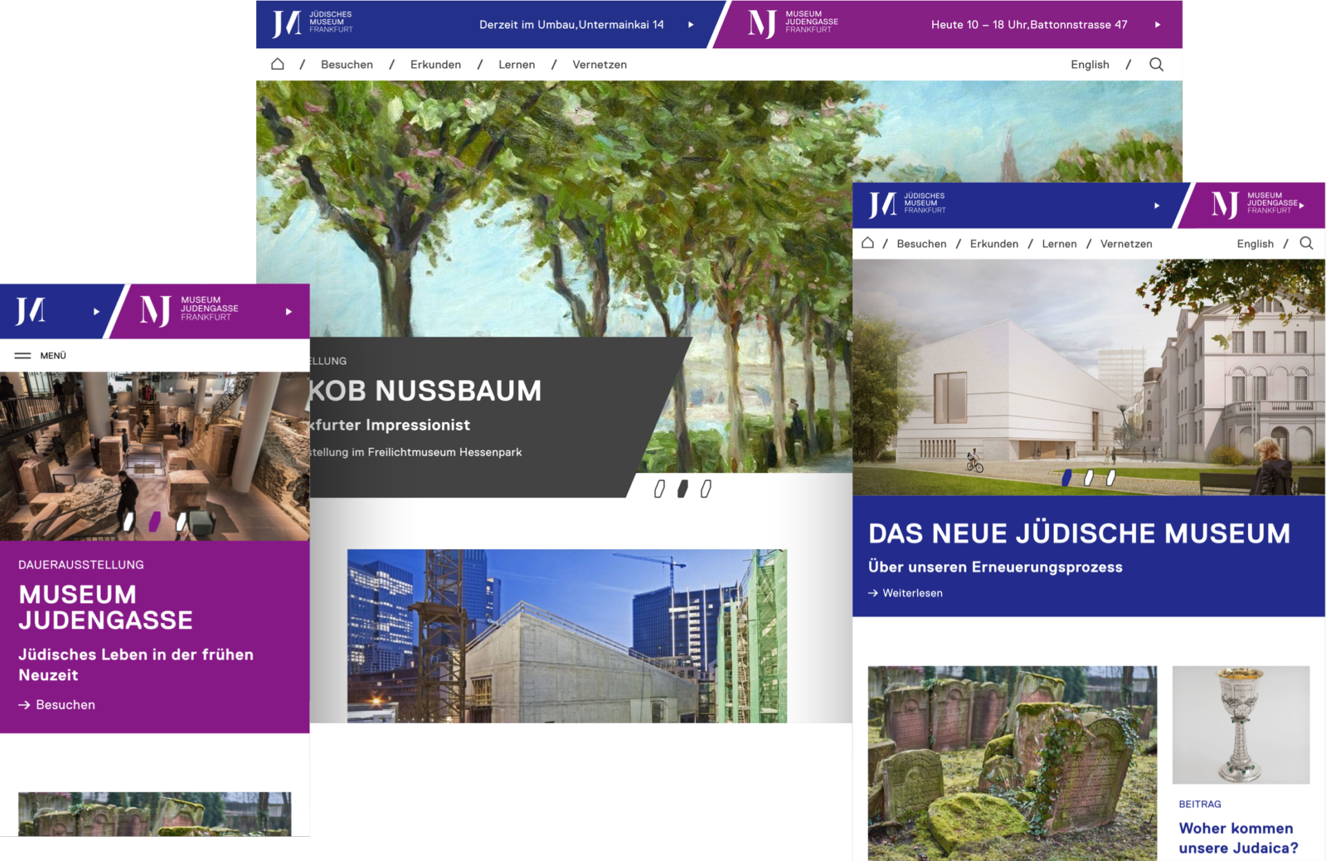
The Jewish Museum Frankfurt actually consists of two buildings - Rothschildpalais and Museum Judengasse. There are less than two kilometers between the two houses, and online they are moving even closer together on a website. Until now, this has often led to confusion. Therefore, one of the core messages of the briefing was to master this peculiarity with the help of a good UX, so that users reach their destination as quickly as possible.
The human being at the center
How do you bring the Jewish Museum and Museum Judengasse together under one digital roof? How can the multitude of events, exhibitions, and educational materials be accommodated? And is it possible to establish an infrastructure for better networking of the social media channels? By putting people at the center - in the museum and on the website. So we developed the user experience from the persona and validated our new concept in external UX testing.
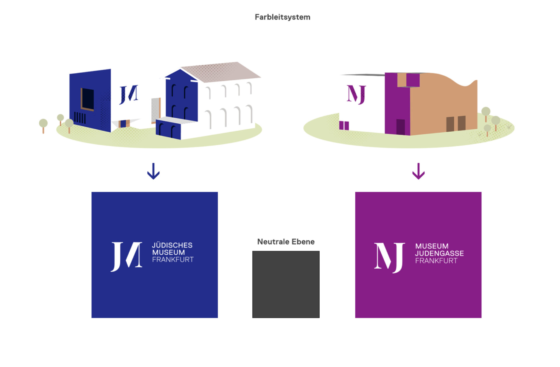
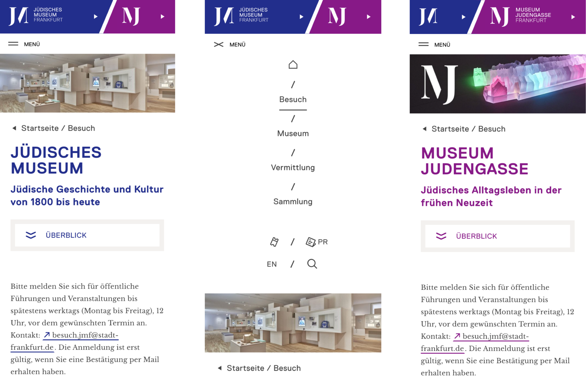
Our design solution for a better visualization of the two locations: a color guidance system that assigns all contents to the respective house and shows visitors where they are at any time. For this purpose, we transferred the color concept of the CI to the web and assigned one color each to the Jewish Museum and the Museum Judengasse. Neutral content and the museum's blog are identified accordingly by two additional colors. We applied this logic to all content on the website. Consequently, all modules are assigned to one color and are thus part of the overarching color guidance system.
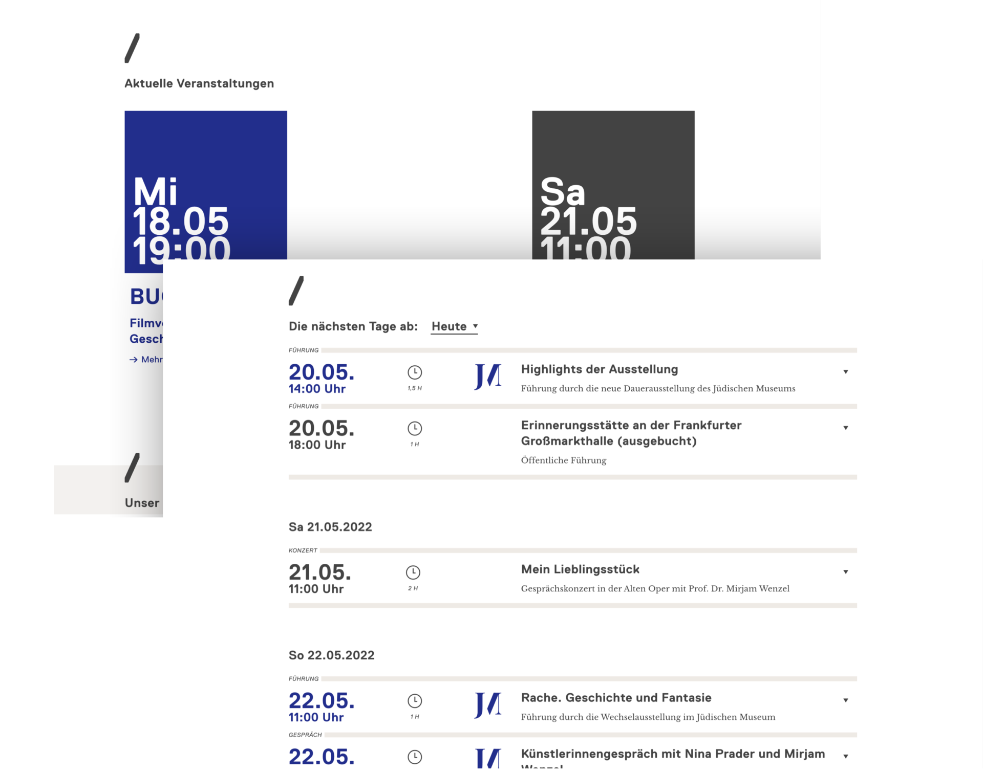
More space for content
When structuring the content, we simplified the structure of the existing sitemap - and focused on better networking as well as less superordination and subordination. In this way, we create a flat information hierarchy that, combined with modern web technologies, conveys a certain lightness and ensures accessibility as well as optimal loading times. All modules on the site are standardized in themselves and equipped with small micro-animations. Their combination creates a lot of freedom for the future presentation of the museum's work.
In the construction kit of technology
As a technical specification, our briefing called for the website to be implemented in the open-source CMS Typo3. Therefore, despite the technical complexity of the site, we remained faithful to the classic back-end - a major challenge given the large number of events, exhibitions and educational materials! So we created all content as data sets, different from pages that just play out this content. Thus, we created a construction kit consisting of many different modules, which enables the implementation in Typo3 as well as the intuitive maintenance of the content for editors.
The result
The new JMFFM website takes on several tasks as part of the digital transformation: It adapts and expands the new corporate design and gives both houses a digital home. It presents the museum's knowledge and educational offerings and provides the infrastructure for communication, including networking of social media channels. The color coding system clearly assigns all content to a location and offers clear orientation for all users at all times.
- 3 Images
Conclusion of our conversion
Web design and usability that can be seen - for this, the Jewish Museum Frankfurt and we were even awarded silver in the category "Website" at the Annual Multimedia Awards 2018.
More cases:
