Branding focussed on the future
‘Digital First’ for a business & IT consultancy
Brands want to make a big impression. However, the day-to-day touchpoints with the target group tend to come in small format: digitally on the smartphone. Accordingly, it makes sense to develop brands ‘digital first’ - to make them adaptable to the digital world, which is constantly transforming and whose future touchpoints are unpredictable. This is exactly what we did for the IT and business consultancy metafinanz. After all, it's about a brand whose core is based on values such as the future, adaptability and transformation.
A new guiding principle
We live in exciting times: The discourse on the future viability of the economy, society and the world as a whole is characterised by upheaval. In this world, companies have to constantly re-examine their own opportunities. This is where our client comes in: the business and IT consultants at metafinanz help companies to bring their future viability to light. Our guiding principle was born, which we make tangible from the brand strategy to the corporate design and tonality to the website - and which in the end even became the new claim.


There is a light...
So we made light our great metaphor. Light as the beginning of everything. Light as energy, life, growth: light makes visible, light provides orientation, light illuminates. Light illuminates possibilities. And the future. We developed the branding for metafinanz from light. Starting with the logo.
Stays in the mind: the animated logo
The new logo for metafinanz is consistently digital: digital media offer the possibility of animation - a static logo would be unutilised potential. That's why our logo is always in motion whenever possible. The light circles around the stable core constantly change their illumination area and open up new possibilities.
The logo symbolises how metafinanz works: agile and networked. It symbolises the ability to continuously adapt to new requirements from customers, the market and society.
Shines with every appearance: the light element
With the light element, we have created a playful element that gives designers flexibility and at the same time guarantees recognisability for metafinanz. The focussed beam of light expresses the adaptability and trend-setting character of metafinanz. It stands out - and is super easy to adapt to any format thanks to an interactive generator developed by us.
Interactive: the light element generator
Designers can use the generator to generate customised lighting elements and fit them into templates according to the intended use. Without any style guide! Download or export → done.
Central touchpoint: the website
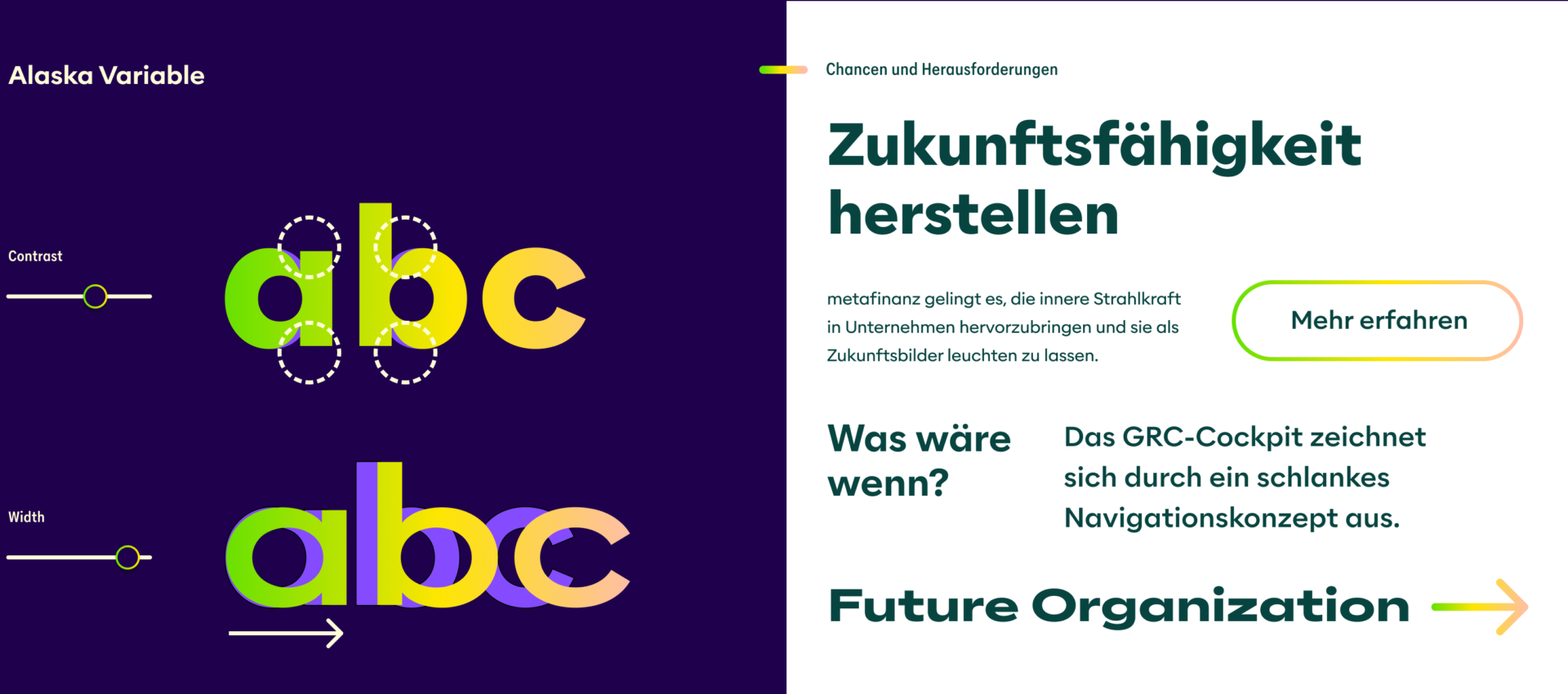
Content analysis, UX concept, redesign, development of modules and templates, content creation including photo shoot: all developed by us in parallel with the brand. Advantage: We were able to test the message house and design system against each other during development and harmonise them precisely.
Guiding lights for the client and creatives
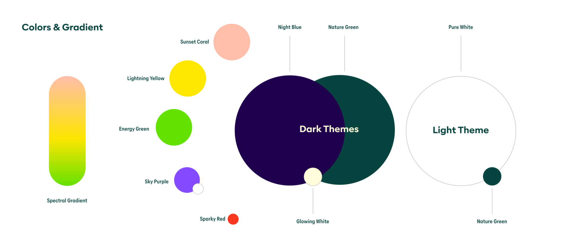
We created design rules, formulation tips and a media library to ensure that designers, editors and project managers create content that is 100% in line with the new metafinanz brand identity. The central Frontify platform contains a style guide, images, icons and a tone of voice to help create future-proof designs and texts.


Curtain up!
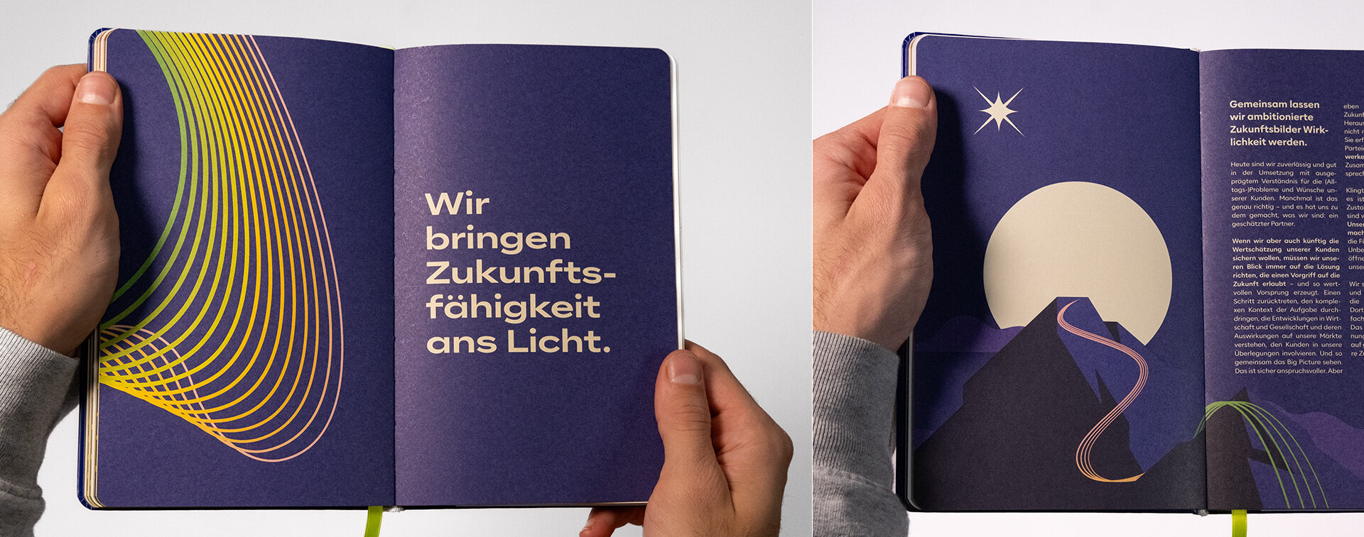
The new branding made its first major appearance as part of the ‘Brand Launch Day’ at the metafinanz site in Munich. Here, everyone could see and feel the new brand feeling in many places: we created the storyboard for a short film that explained the strategy behind the new corporate identity. In addition, the logo and the lighting element now shine throughout the building, a brand book answers all questions in detail - and the new brand is also available to wear. A moving start that brought the future viability of metafinanz to light for all those present!
- 5 Images
More cases: