From Background Company to a Confident Corporate Brand
fair. for everyone.
“What do we want? Simplicity, independence and maturity – but emotion and excitement too.” This was eyeo’s wonderfully simple brief. It sounds straightforward but in reality it was quite a challenge to achieve for a tech firm with the complexity of eyeo – a business that makes most of its turnover from B2B products for diverse customer groups. You name it, we revamped it (or defined it from scratch).
»
In less than a year of intensive collaboration we’re moving forward with a strong brand and a fitting design system.
From strategy, product and brand architecture to corporate design, tonality, and a new website as the central touchpoint for all future brand communication. The tech world is unpredictable, which meant our solution for eyeo had to be as adaptive and flexible as possible.

Corporate Brand Strategy
eyeo’s story is fascinating and emotional. It’s one of radical user-centricity, sustainability, and a fair internet for everyone. The new strategy coupled with an overhaul of the company’s brand foundations (purpose, vision, mission, and values) gave life to a brand manifesto which is now used to guide internal and external communication. We brought everything together with a new claim: fair. for everyone. And for more transparency and simplicity we sharpened tonality – stripping it of the usual B2B jargon to keep it relevant for different target groups, products, and features.
Corporate Design
The new corporate design follows a simple code:
- Be bold
- Be balanced
- Be business-to-human
Together with eyeo we explored a range of visual styles before committing to a direction which focused on one core theme: clarity. Our Balancing Pattern approach translated the company’s new strategy into a vibrant, contemporary visual form that works across all touchpoints. The new colour scheme, centred around blue and green, helps express eyeo’s values, transparency, integrity, and responsibility. A sustainable highlight is the dithering filter used in the visual execution. Much like an ad-blocker it filters out colours to reduce web server loads and keep the website’s carbon footprint as small as possible. All design proposals were tested in real time by internal eyeo stakeholders as well as the company’s clients – an incredibly rewarding process which quickly validated outcomes and results.

Internal Launch
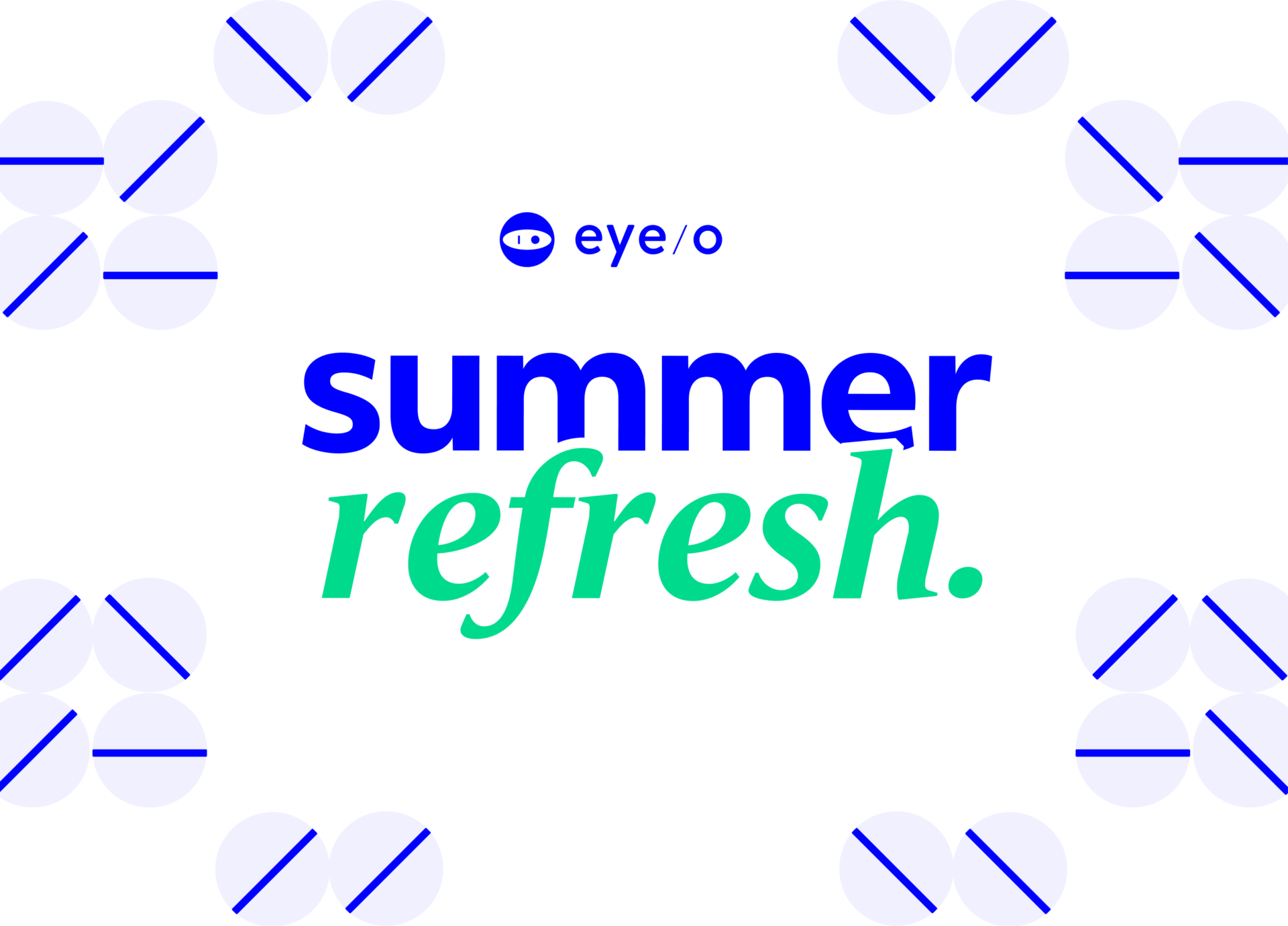
The new brand was revealed at the annual eyeo employee meet-up, held this year in Amsterdam. It was our job to come up with an idea that interconnected the brand relaunch with the event’s program. Our response: summer refresh – a fun and relaxed way for over 300 eyeo employees to experience the new brand – upon arrival, on stage, with sound (Spotify playlist), with branded giveaways, and photo features. The event was a hit – generating lots of buzz and positive feedback from impressed employees.
Website Relaunch
Our comprehensive relaunch of the eyeo website included UX analysis, concept, module and template design, as well as all front and backend programming. We responded to the brief’s call for simplicity and emotion with a solution that gives its many target groups orientation and clarity. Content on the News and Career sections is delivered dynamically from existing eyeo partners Hubspot and Greenhouse.
- 4 Images
External Launch
The next external milestone was the company’s presence at DMEXCO (2023 Digital Marketing & Exposition Conference, in Cologne). Our job was to devise a concept and creative execution for the eyeo conference stand. Our idea: a calming oasis of balance and tranquillity – right in the middle of a busy conference. With the motto filter it out we created a relaxed space – made of wood and plants – where delegates could unwind and get to know eyeo. In close cooperation with Zenit Messebau GmbH, we ensured eyeo’s first non-digital conference appearance was as creative as it was green.
More cases:
