From a greenfield to an interactive brand
How we transform the Berlin House of Futures into the digital Futurium
A mix of museum, makerspace and event center, Berlin's Futurium offers a whole lot of activity centered around an elusive topic: the future. Our digital Futurium (the term "website" was not expansive enough) was developed from a static style guide and an impressive – but empty – building. In the process, not only was a seamless connection between digital and analog exhibition created on the greenfield site, but also further developed into a playful, mobile and interactive digital brand.

Kick off: Understanding the future
In the Berlin exhibition and event house, everything was to revolve around distant utopias, conceivable scenarios and what might be important tomorrow. The website needed to reflect this approach and make future scenarios digitally accessible to everyone. But what is it actually – the future?
Making future tangible and accessible to all, at any time
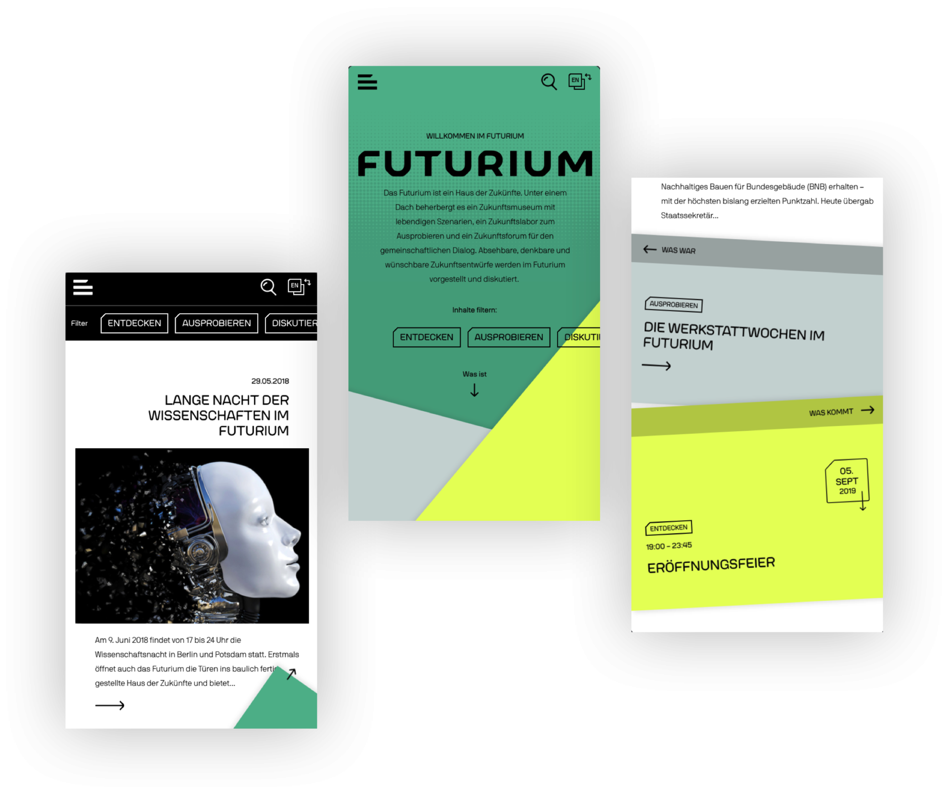
In user interviews, it quickly became clear that "you can only understand the future if you know the past and the present". True to this guiding idea, we developed the three-part structure of the website: "What is", "What was" and "What is coming." Every newly added content piece traveled through each section once. This way, tomorrow's event is real today, but a few days later belongs to the past and wanders into a visible collection of previous events, without having to be discarded.
»
When you come to our site, the first thought should be: Oh, that's right - you can do it that way!
Further development with the overall goal in mind
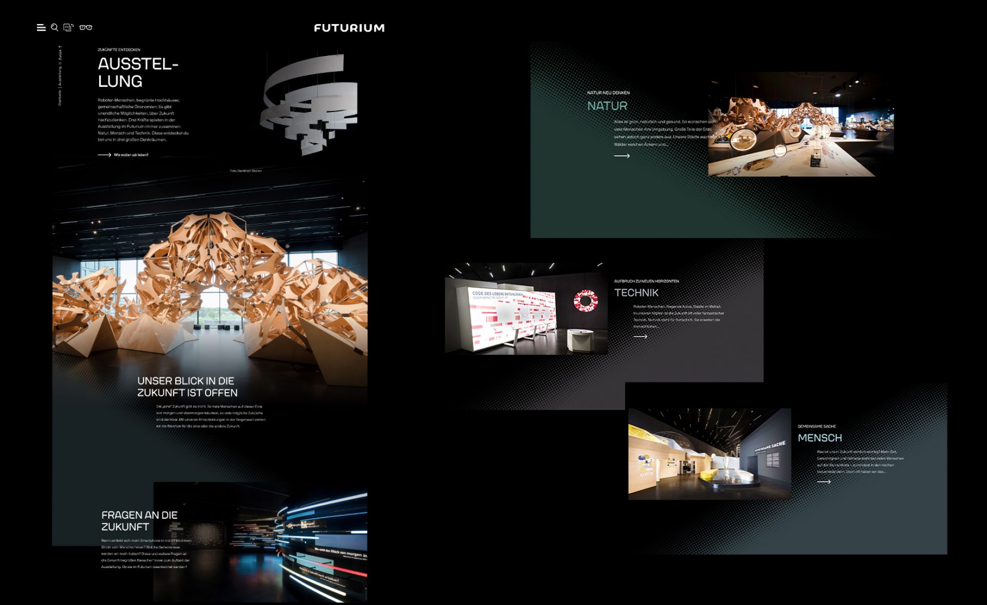
In current and future expansion stages, the physical and digital Futurium are moving ever-closer together. Exhibits can be memorized on site using a token wristband and later viewed together on a separate exhibition page on the website. The exhibition page is being gradually expanded with further features. For example, visitors can digitally navigate through the Futurium using a map. What has been experienced is underlined both textually and visually on the way to individual exhibits. Here and there, you can even stumble upon a little treasure or hidden knowledge.

The transformation of the digital brand
In the beginning, there was a lot of space: Three square kilometers of empty exhibition space in a slanted, dotted building. The space, which had already won a Red Dot without content, set the bar high for the digital version. Collaborating closely, the design and UX teams developed innovative, interactive elements and pushed the design manual to its limits. The foundation for our work became the massive black architecture with the slanted roof, and this is reflected in many digital elements today. Content was given enough space on a white background. Futurium relevant content was marked with dots. But the future can't just be black or white - the future should be bold and always look different. So why not develop color trios that change daily and influence selected content modules?

- 5 Images
More cases: